
Photo Credit: https://www.pexels.com/photo/girl-reading-a-newspaper-6214/
1) Fonts: Embed, Outline, and Include
“Your fonts are corrupt.”
“Your font didn’t come through.”
“We don’t have your fonts.”
Ever heard any of these statements after sending files to your printer?
To ensure that your print job maintains the proper spacing, and the font looks the same as when you submitted the order, you need to embed, outline, or include the fonts. Even if you think it’s a common font that “every printing company should have”, repeat this mantra: embed, outline, or include.
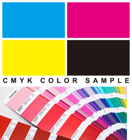
2) Color: CYMK vs. Spot
CMYK: Cyan, Magenta, Yellow, and Key (aka: Black). This term is used for the four-color printing process, in which layers of color build specific colors in digital presses. The best color
build for when you intend for your project to be printed on a digital press.
Spot Color: The process in which a very specific color is mixed and printed. The best way to apply PMS colors is when you are printing on an offset press and need an exact color match. To create a document with spot colors, you must create or add a swatch of the PMS color you’re using to ensure the document contains the necessary information for your printer. Don’t forget if you are creating a spot color project, to set your colors to ‘spot’ and not ‘process’ color.
3) Images: Link and Package
Missing images in print files is another common problem. Images include any photos, logos, or any non-type components.
For best print quality, image resolution should be 300 dpi (dots per inch) in the selected size or higher, in order to keep the photo from appearing blurry or pixilated when printed. The images in your document should be defined as CMYK or spot color, rather than RGB.
Link your images, and then package your document before sending to your printer.

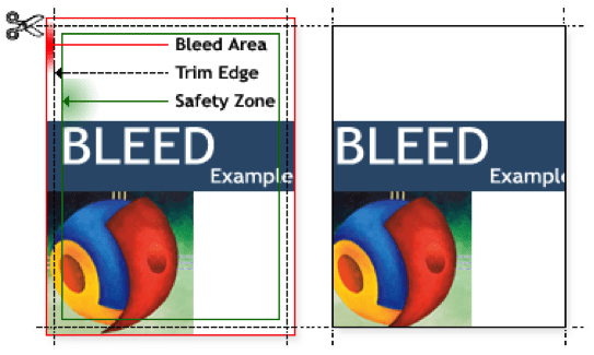
4) Bleed: You want it to “drip” outside the lines…get it?
What is a bleed? A bleed is when an image, block of color, or other graphic element appears to run off the edge of the sheet, with no appearance of a white border.
To accommodate a bleed, the artwork is printed on an oversized piece of paper that will later be trimmed to the actual size of the final piece. “Pulling the bleed”, or extending the artwork by 1/8 inch to ¼ inch beyond where it will be trimmed, is something frequently overlooked by the designer before the artwork is submitted for press. When you open a new document in InDesign or Illustrator, for example, you can create the document with the bleed amount (.125 inches – .25 inches) in the Document Setup window.
5) Imposition: the page arrangement, not the inconvenience.
In printing, imposition is the process of arranging all of the pages of your design onto the paper in order to print faster and to reduce extra paper waste. Thanks to layout-oriented programs, setting up a multi-page design to be published in a brochure or booklet is much easier. Don’t forget to add a little extra space to your design in the center to compensate for the binding.
Don’t forget, with Davant Greenfield printing, you can order online by clicking here. Not your thing, give us a ring at